

Did you know you’re a designer?
Designing is a part of our everyday lives, even when we’re not consciously aware of it. Picking out your clothes, choosing your favorite color (ours is blue if you couldn’t guess), and arranging meals on a plate. Since you’re already designing in the real world, let’s talk about some “industry terms” in the digital product realm. Join us as we crack open our metaphorical toolbox.
Jump right to a term:
FPO + Lorem ipsum dolor sit…
FPO means “For Placement Only.” This term pops up in the planning stages of a project. Literally, the letters “FPO” can be found on top of images in a mockup. It’s used as a visual to signify “this image is here now, but it won’t make it to our final product.” The FPO images are then replaced with permanent images before your site or product goes “live.”
(Bonus term) “Live” means your site, app, or product is on the internet available for the public to access.
Lorem ipsum dolor sit amet… It’s the text you see in your app or design screens during the production phase, also known as “pseudo-Latin.” Though it looks intimidating, there’s not much mystery here; Lorem ipsum operates as a placeholder. Sometimes when we’re working on a project, the content doesn’t exist yet, but we need to design around something. Lorem ipsum does the job. What “Lorem ipsum” actually means we’re a bit less sure about…
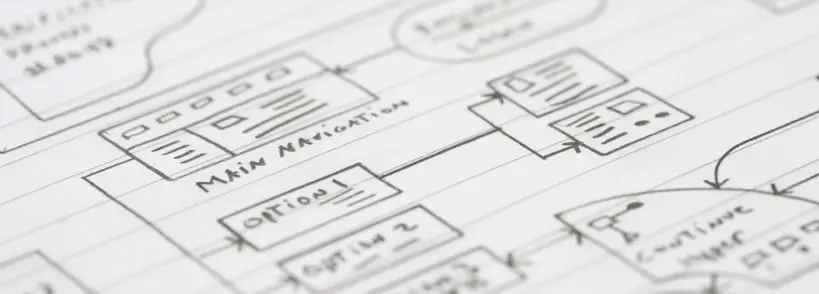
Wireframes: Minimalistic Plans, Maximized Planning

Wireframes are used to outline page layouts and can be done digitally or on paper. A wireframe allows you to see the major elements that make up a page without distracting design elements like color and images.
Wireframing happens at the start of a project. It’s a time and dollar saver; it’s much faster and cheaper to make changes to a page while in this stage than in development.
Wireframes can vary in detail; You might hear terms like low-fidelity (minimal detail), mid-fidelity, high-fidelity (very detailed). How much detail is needed in a wireframe can depend on the complexity of the project.
Finding Your Way Around: Information Architecture & Sitemaps

If you were building a house, you wouldn’t want to create a hallway to nowhere or a never-ending corridor. People who come to visit would get quite frustrated hitting a dead end and probably want to leave. This same idea applies to your site architecture.
Information architecture is how your pages relate to each other, site content is linked, and users navigate. It’s often part of the wireframing or early stages of a project and informs the sitemap. Planning your website’s information architecture is essential to ensure your users can intuitively get to the information they’re looking for.
A sitemap is a file with information about your pages and other content on your site. A sort of site table of contents. Search engine crawlers appreciate good site architecture, and a sitemap can improve the crawling of your website.
What Makes a Style Tile
A style tile is a file that contains information outlining web and branding elements. It can include colors, fonts, and features that become part of a larger digital brand. A style tile can function as a middle ground between a mood board and a complete mockup. It can be a helpful file to refer back to as your brand or website grows and evolves or you branch out into new digital endeavors.
Logos: File Formats and What They’re For
You love your logo, but why do you need it in so many forms? .SVG, .PDF, . EPS – What does it all mean? We’ll go over some of the most common logo file formats and when to use them.
.ai (Adobe Illustrator) – AKA your logo source file. You or your designer will use this file to export from to create all the other file types listed below.
.eps (Encapsulated PostScript) – Intended for print use, it can be sized up or down without losing quality.
.pdf (Portable Document Format) – PDF files can vary in quality, depending on what software they were generated from and export settings. High-resolution PDFs are used for print. Lower resolutions optimized for quick load time are best suited for the web.
.svg (Scalable Vector Graphic) – Intended for web use, SVGs are scalable without sacrificing quality and support transparency. This file type is ideal for logos and icons used online. SVGs are ideal because the graphic edges appear crisp on resize, unlike a PNG or JPG file where the edges look blurry.
.png (Portable Network Graphic) – Intended for digital use, this file type supports transparency but cannot be sized up without risking looking pixelated or blurry. If the software or program you’re using doesn’t allow SVG uploads, then a PNG is the next best option.
.jpg (Joint Photographic Experts Group) – Intended for web or print use. This file type is best used for photographs and does not support transparency. Like PNG files, once created, JPEGs will look pixelated if sized up.
(Bonus tip) A website developer will most often ask you for your logo in a .svg or .png file format.
Takeaways:
A bit of understanding goes a long way. We hope that your venture into a design project can be a bit smoother after learning just a few of the terms you’re likely to hear.
Sources:
FPO in Graphic Design, LOREM IPSUM, What Exactly Is Wireframing? A Comprehensive Guide, What is Website Architecture?, Learn About Sitemaps, Style Tiles, How to Choose the Right Logo File Format…Finally!
Related Articles

The Era of the Toxic Rebrand
-

 Jacob Trunk
 - |
- April 30, 2026
- |
- 4 min read
One of my favorite pastimes is walking around art museums, and our corner of Philadelphia has no shortage of them. The Barnes Foundation offers a unique perspective on late 19th and early 20th-century contemporary art. The Rodin Museum makes the artist’s unique vision personal by laying out his process alongside his finished works. But the […]

Strategy As Corporate Anthropology
-
Jacob Trunk
- |
- March 3, 2026
- |
- 5 min read
I have a friend who works in logistics. The last time we spoke, he told me a story about a stressful situation he was dealing with at work. Tensions were high internally over a somewhat trivial matter, but to the individuals involved, lines had been drawn, and folks were dug into their own version of […]

Designing for Behavior
-
Jacob Trunk
- |
- November 7, 2025
- |
- 4 min read
In a rapidly changing digital world, it’s natural to feel the pull on our skillsets, wondering which to grow and which to let go. While some AI futurists argue for abandoning processes that have been refined over decades, we take a more balanced approach. We’re constantly testing AI tools, and while they’ve become a valuable […]