



One of my favorite pastimes is walking around art museums, and our corner of Philadelphia has no shortage of them. The Barnes Foundation offers a unique perspective on late 19th and early 20th-century contemporary art. The Rodin Museum makes the artist’s unique vision personal by laying out his process alongside his finished works. But the most comprehensive collection, and the one that has something for just about anyone, has to be the Philadelphia Art Museum. The museum itself is iconic. Some of the greatest works in art history live within its walls, including the world’s most robust collection of one of my personal heroes, Marcel Duchamp (the guy who signed the toilet). Along with the impressiveness of the collection, the very building they sit in is a cultural landmark. I don’t think I’ve ever been to the museum during daylight hours without seeing some patron doing the Rocky dance at the top of its steps. In short, the Philadelphia Museum of Art brand is a powerhouse.
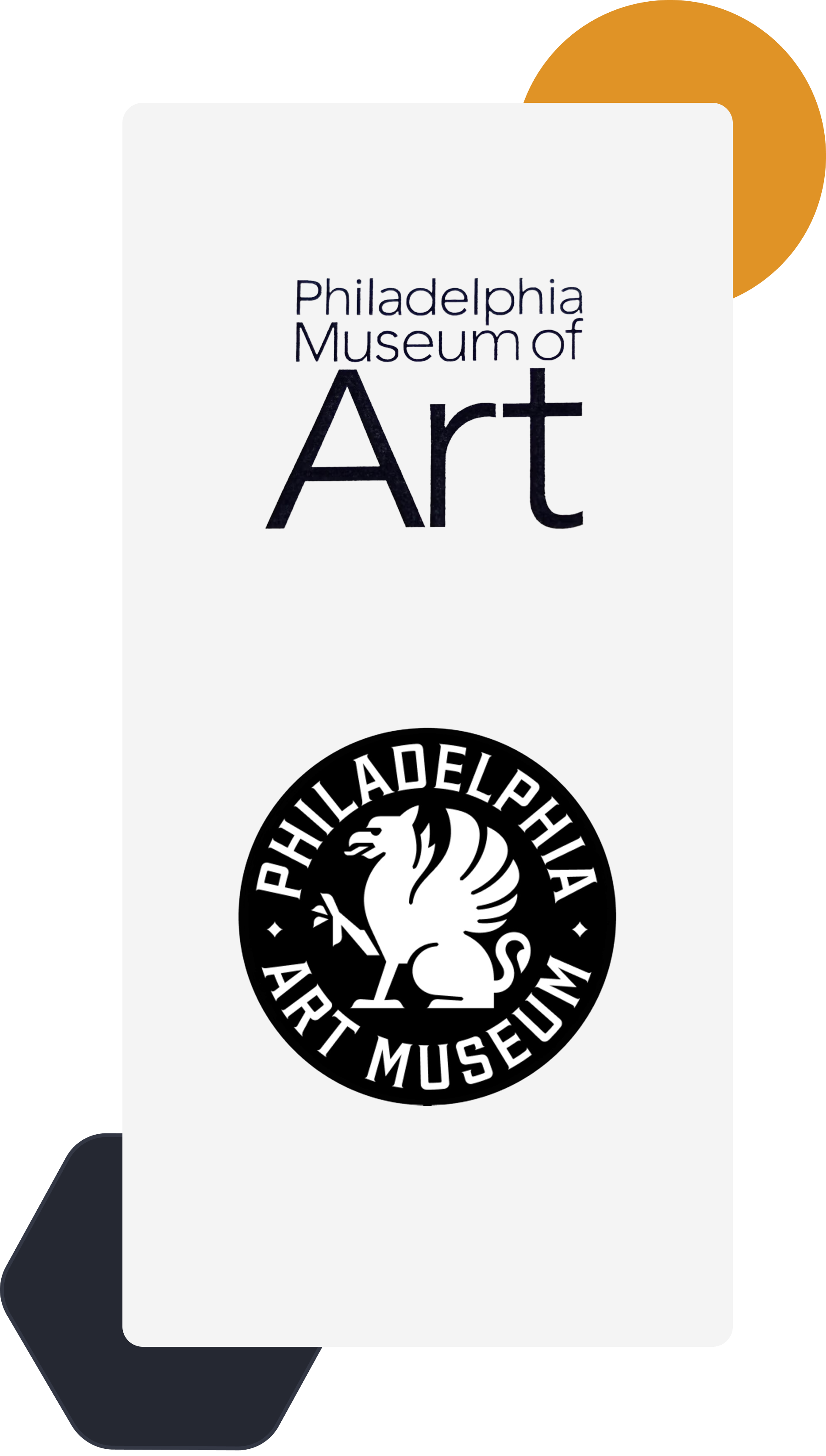
When the Museum launched its now infamous rebrand, I was actually a bit underwhelmed. It combined elements of nostalgia and a street art sort of edginess. The griffin motif in the branding isn’t that new; the griffin itself has been on the top of the building since the late 20’s, and they’ve been using it as part of their branding for well over half a century. To me, it felt like one of those “Why did they spend all that time and energy doing this?” moments. What DID shock me was the public outcry. To be honest, I couldn’t tell if people were really that offended or if it was just fresh fodder for content farming. People were reacting with a level of enthusiastic dislike that I didn’t see coming. A lot was clearly folks just trying to come up with hot takes, but in general, people found it to be an attempt to make the grand intellectual institution look like a sports team or an athleisure brand.
There was also the issue of the name. To go from a powerhouse name that had been around for 80 years to something that was, in reality, not quite different enough, caused a lot of unforeseen problems. First of all, the acronym changed from PMA to PhAM, a genuinely more confusing acronym, and according to an article from 34th Street, it places it in an SEO conflict with a popular Vietnamese surname. But not long after the rebrand, most keyboard commentators had adopted an even worse unofficial acronym PhART. Not long after the debacle, the museum director and CEO, Sasha Suda, was fired by the board, and the CMO, Paul Dien, who oversaw the rebrand, resigned. By February of 2026, the board voted unanimously to revert to the old name. Bringing the whole saga to a close, at least for now.

The museum isn’t the only large institution to face backlash and the eventual reversal of a rebrand recently. Cracker Barrel tried a rebrand due to lagging patronage among their core demographic and a nearly 40% drop in stock price. In August of 2025, they released the new logo, which very noticeably dropped the old man. It also changed typefaces and dropped the subtext “Old Country Store,” but that didn’t seem to garner as much attention. The new logo was part of a larger effort to rebrand, including remodels of all of its locations.
The reaction in this case became part of a sensitive political narrative, to the point that the President encouraged Cracker Barrel leadership via his social media to reverse the decision. When they did, he made it a point to congratulate them on the decision. They also announced that the efforts to remodel the stores would also cease.
The Cracker Barrel rebrand differs from the Philadelphia Museum of Art rebrand in that it was a good-faith attempt to correct lagging sales. Whereas PMA’s rebrand did not seem to have a solid strategy behind it. But the undeniable similarity in both is the failure to anticipate how much cultural meaning was stored up in each brand. This, my friends, is a failure to understand their patrons, customers, and users. Good user experience helps to build trust in brands, and decades of good user experience can create a loyal base that considers a brand to be part of their own identity, or at least to be part of their cultural identity. In the era of the toxic rebrand, we have to be aware that the first step in a rebrand process must be understanding how our primary users will react.

Jacob Trunk
Creative Strategy Director
Jake Trunk is our Creative Strategy Director. He brings a passion for creativity, sound design principles, and a desire to provide delightful digital experiences. Jake is always eager to walk our clients through the process of understanding their users, identifying the users’ needs, and creating digital products that help them accomplish their goals. His aim is to always provide innovative and intuitive solutions to digital problems. Jake brings skills in all kinds of creative mediums from digital illustration to website prototyping, and he believes that the muscles of creativity grow stronger not only with repetition but with stretching. Outside of work, Jake can be found in his art studio working on his latest paintings, or spending time with his wife and two small kids.
Related Articles

The Return of Craft in a World of AI Design
-

 Jacob Trunk
 - |
- July 30, 2026
- |
- 5 min read
There’s a production studio in Hillsboro, Oregon called Laika. They specialize in stop motion animation. They produced the benchmark-setting Coraline in 2009, redefining what a stop motion movie can achieve. For their production Kubo and the Two Strings, they released time-lapse videos of the grueling two-day-long process of shooting a few seconds worth of a […]

AI Won’t Fix a Data Problem. It’ll Crank It Up to 11.
-
 Tim Haak
 - |
- July 16, 2026
- |
- 7 min read
Why data maturity has to come before your AI strategy, and what to do about it. I’ve been thinking about data a lot lately. Every organization has been amassing mountains of data by using various products, systems, and tools for many years. At the same time, a lot of folks are excited about how AI […]

Strategy As Corporate Anthropology
-
Jacob Trunk
- |
- March 3, 2026
- |
- 5 min read
I have a friend who works in logistics. The last time we spoke, he told me a story about a stressful situation he was dealing with at work. Tensions were high internally over a somewhat trivial matter, but to the individuals involved, lines had been drawn, and folks were dug into their own version of […]